What subway station has the most passengers getting on the train? What subway line has the most riders? What subway station has the most passengers getting off the train? These should be easy questions for the MTA to answer, with all the data we collect from the turnstiles, right?
Nope. We do get subway entry data for every rider swiping their MetroCard or tapping their OMNY card or device, but since riders aren’t swiping or tapping out at their destination, we don’t directly know where they’re going. Furthermore, we only know what station the rider entered; if there are multiple lines servicing the station, we don’t know which one they boarded. Adding to the mystery, our fare data can’t tell us if a rider changed trains during their subway trip. At some stations, those mysterious transfers are a big portion of ridership! Do we have any hope of making sense of subway ridership patterns in NYC, given all these unknowns?
Actually, we do, through algorithmic magic called ridership modeling. The fundamental “trick” of MTA subway ridership modeling is that by applying a set of simplifying assumptions about subway rider behavior, we can make a reasonable guess of each passenger journey’s destination, and from that we can estimate the trains they took to get there. This guess for each individual trip will be wrong a lot of the time: as much as the MTA Data & Analytics team would like to be, we’re not omniscient. But—this is the trick—the errors in the journey inference should be random, so when aggregated across thousands and millions of journeys, these errors should cancel out, resulting in reasonably accurate estimates of line- and station-level ridership patterns.
Let’s break down how this works.
Destination inference
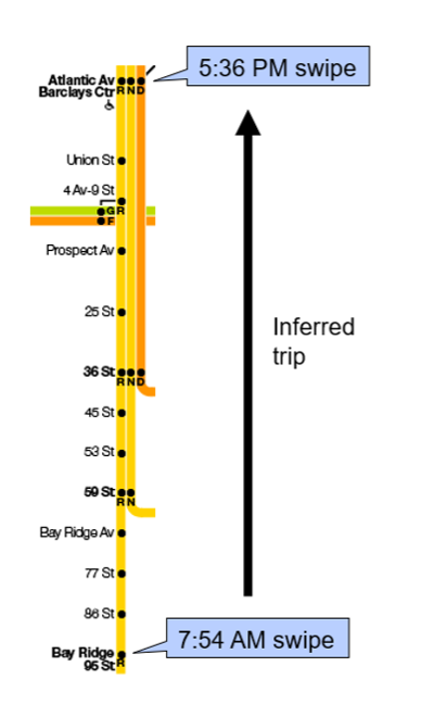
The first step in modeling subway ridership is to estimate riders’ destinations. To do so, we apply a simple assumption: a subway trip’s destination is the station the rider next swipes/taps at. Take a hypothetical example, illustrated below. If a rider swipes their MetroCard at Bay Ridge-95 St at 7:54 a.m., and their next swipe is at 5:36 p.m. at Atlantic Av-Barclays Ctr, we infer that the rider’s 7:54 a.m. trip was from 95 St to Atlantic Av. We link pairs of subway swipes/taps based on the MetroCard ID number or OMNY card or device number, which we scramble before analysis to anonymize the data.
What if there is no next swipe or tap? For example, if a user switches from MetroCard to OMNY, that breaks the “chain” of linked subway entries. In that case, we assume that if there are at least two subway entries that day, and no available entries after that day, the destination of the last trip is the same as the origin of the first trip that day. We’re essentially assuming that the first swipe/tap of the day is the rider’s “home” station, and they return home at the end of the day. Extending the illustrated example, if those two swipes were the only swipes we had for that MetroCard, we would assume the destination of the 5:36 p.m. swipe at Atlantic Av was 95 St.
Sometimes, there simply is no way to infer a destination for a trip. For instance, we may have an OMNY card or device with a single trip, so we have nothing to base a destination from. Or we could see a MetroCard swiped at the same station 20 times in a row; the holder of that card was probably selling swipes, not riding the subway around in circles. For these situations, we “scale up” the trips with inferred destinations to account for the rides without inferred destinations. We apply an additional scale factor to account for fare evasion (with the implicit assumption that fare evaders have similar travel patterns as paying customers). The scaling is done at the level of day, station, and hour. For example, if a station had 500 entries between 8 and 9 a.m., of which 440 had inferable destinations, and our system fare evasion for that quarter was 10%, we would apply a scale factor of [1/(1−0.1)] × [500/440] = 1.263 to every inferred destination trip. In other words, every trip with an inferred destination would be given a weight of 1.263 trips when tallying up ridership.
Modeling ridership
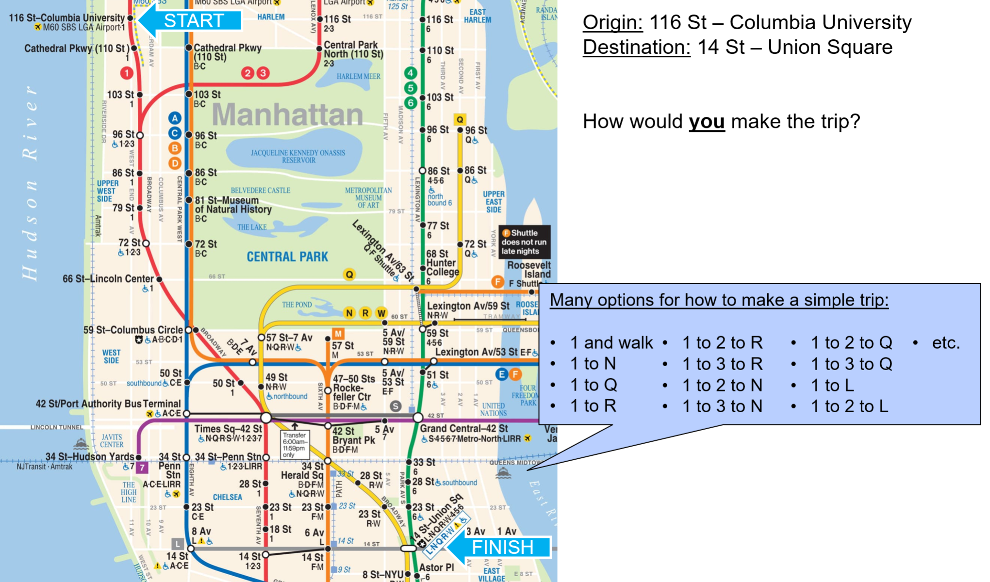
Once destinations have been inferred, and trips appropriately scaled, the next step is to estimate the “path” the rider took from their origin to their destination: that is, the set of trains they took (the specific train, not just the line—e.g. 14:20 Pelham to Brooklyn Bridge, not the general line) and transfer locations between them if more than one train was used. Given the complexity and interconnectedness of the NYC Subway system, this is not easy. Take the hypothetical example below, of a trip from 116 St-Columbia University to 14 St-Union Square. There are many feasible options of different lines to take between the two points, which may take a similar amount of time. Furthermore, riders make choices based not just on pure speed, but also “comfort” factors like number of transfers, crowding on the train, walking time, etc.
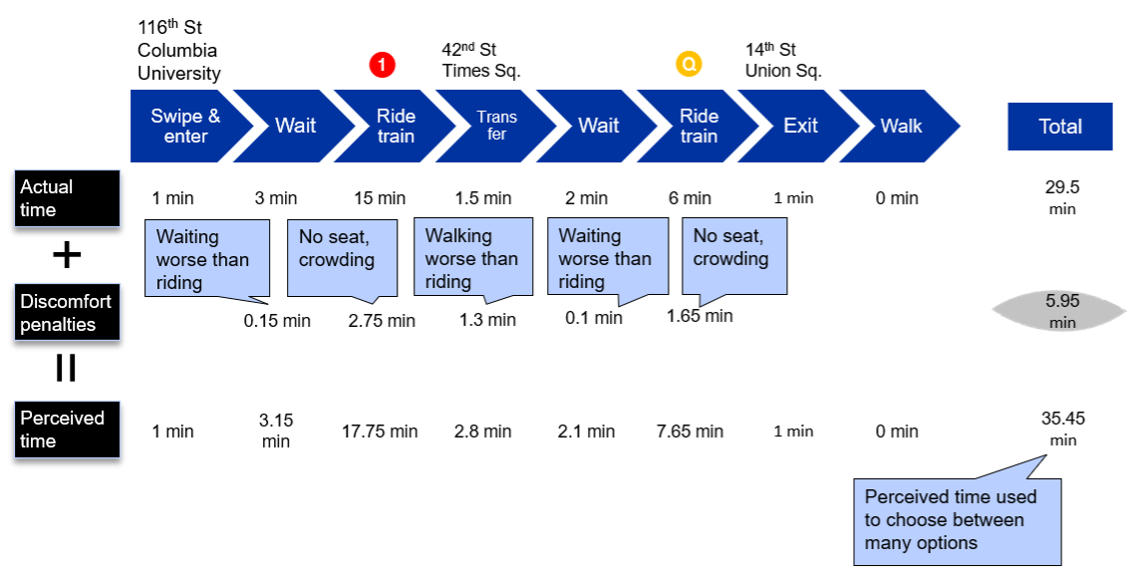
Our solution to this is to assume that riders choose the “shortest” path according to their perceived time, not the actual time. The perceived time is a combination of the actual time it takes to travel from the origin to destination—including waiting time on the platform(s), time on the train(s), and walking time in the station—and discomfort penalties added on for things that are well, annoying or uncomfortable: train crowding, having to walk a ways to transfer, waiting a while at the platform (less comfortable than sitting on the train). These penalties are calculated using fixed formulas based on whether someone is randomly selected to be a “speed first” or “comfort first” rider; the latter rider is more willing to have a longer journey to avoid discomfort. To extend the hypothetical example above, suppose we are trying to evaluate the perceived time of the to option. We first calculate the actual journey time, using the first train to arrive after the user swipes in, and the first after the gets to Times Sq-42 St, which comes to 29.5 minutes. We then add in two crowding penalties, a transfer penalty, and two wait time penalties, based on fixed factors applied to the actual time and/or walking distance (the ratios here are only illustrative examples—actual factors are changed over time as the model is refined). This produces a penalty time of 5.95 minutes and a total perceived time of 35.45 minutes. We repeat this for all line options ( to , to , to to , etc.), and choose the option with the shortest perceived time.
Once we’ve repeated this for every destination-inferred subway ride of the day, are we done? No, not yet. Something that was elided in the previous step was the source of the crowding information the rider uses to base their crowding discomfort on. Before we assign passengers, we don’t know how many people are on the train, so how can we know how crowded the train is? We don’t, until the first time we assign passengers to trains. The solution is to assign passengers to trains not once but multiple times, starting with empty trains, and in subsequent iterations feeding in the crowding results of the prior iteration as input levels off which to base the penalties. This repeats 10+ times, enough times for the crowding levels to reach an equilibrium across iterations. The results of all iterations are then combined using a weighted average to produce a final subway ridership assignment for the day.
Modeling results!
After the passenger assignment is completed, the results can be aggregated across different dimensions to produce many kinds of summary statistics, including:
- Line ridership: Sum the (scaled) passenger trips using that line for at least one leg of their journey.
- Station boardings: Sum the (scaled) passenger trips boarding trains at the station, either as their first station or a transfer.
- Station exits: Sum the (scaled) passenger trips whose ending at each station.
- Origin-destination flows: Sum the (scaled) passenger journeys from each origin station to each destination station.
- Peak load points: For a given line, find the average passengers on the train at each station; the station with the highest average is the peak load point. (Usually, we do this separately by direction and a.m./p.m. peak.)
Statistics like these are used both for internal service planning purposes (e.g., deciding how many trains to run during the a.m. rush based on crowding), and as an input into the MTA’s customer-focused subway metrics.
Conclusion
We hope this whirlwind tour of our fare-based subway ridership modeling process sheds some light on the challenges involved in understanding subway ridership patterns in a system as big and complex as the New York City Subway, and the cool algorithms the MTA has grown in-house to tackle them. For brevity’s sake, there is a lot of technical detail left out here; if you’d like to learn more, check out the documentation of our subway customer-focused metrics on the New York State Open Data portal. If you’d like even more detail than that, see this article the original authors of the program published in Transportation Research Record.
The program is not, and probably never will be, a finished project—there are always tweaks to be done, parameters to tune, and more validation to do to improve our understanding of how New Yorkers get around their city. If you have any suggestions to improve our process, send them our way at opendata@mtahq.org.
About the author
Daniel Wood is a data science manager with the Data & Analytics team, specializing in subway and bus performance reporting and analysis.