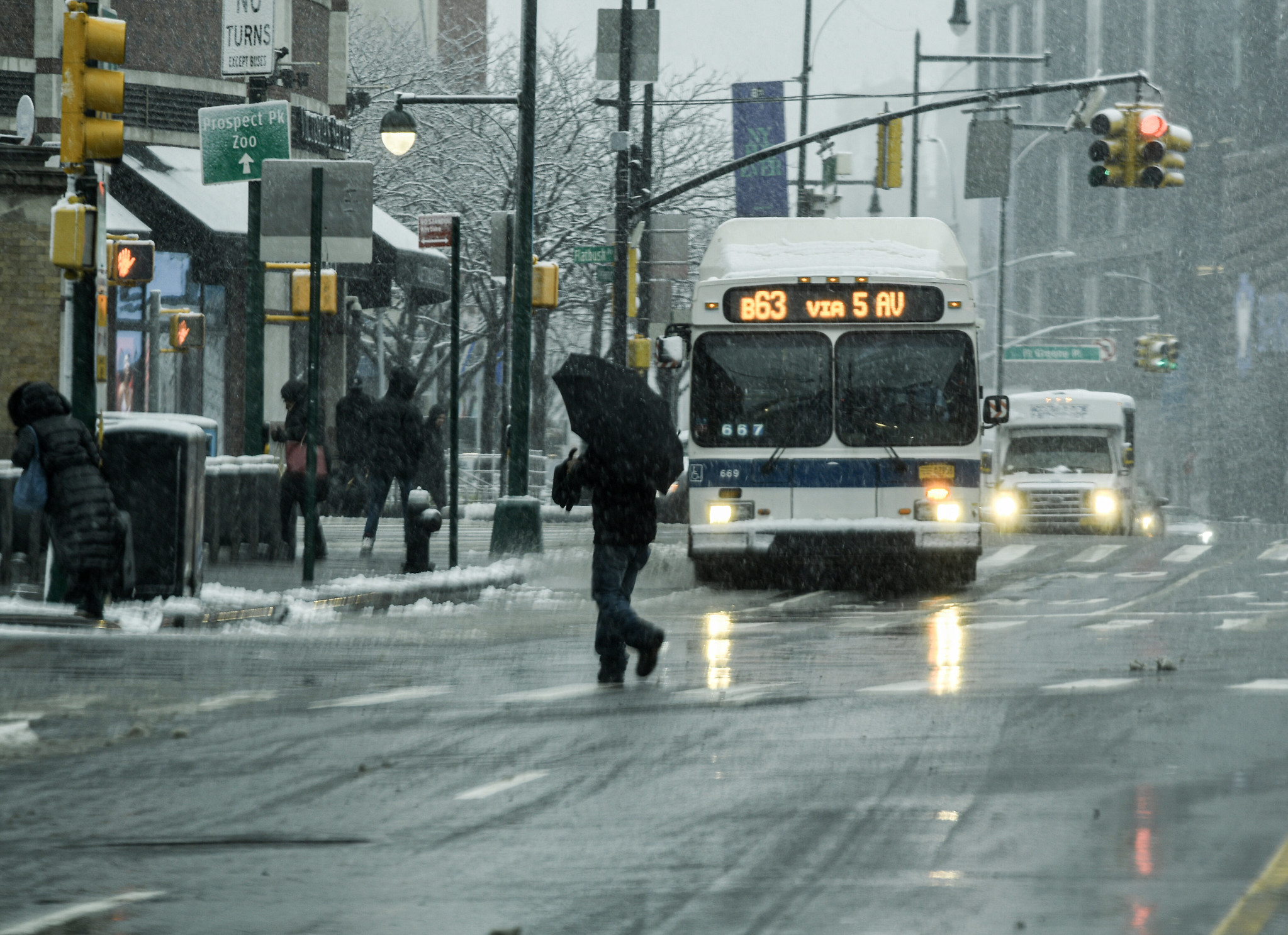
It’s been a whirlwind month for MTA Open Data! Our team has been busy celebrating NYC Open Data Week, which happens annually in March. We’ve published additional resources, extra blog posts, and released our annual update to the Open Data Plan. To cap off our busy month, we’re back with one more open data-focused blog post that is focused on you, the user, and ideas for topics you can explore using our wide array of open datasets! We have more data and ideas than time allows our staff to investigate, so we hope this post will help jumpstart your next open data project!
Create a visual
Our first and simplest suggestion is to use our data to create a visual. Our own site, metrics.mta.info, uses Python to create interactive visuals using our open datasets on data.ny.gov. We love a clean line chart, like the ones we publish for Subway Mean Distance Between Failures and Metro-North On-Time Performance. For some of our visuals, like Major Felonies, we offer the option to toggle between line and stacked bar charts.
One dataset we love but haven’t visualized on our site yet is Express Bus Capacity. This data shows how crowded express buses are for each route by hour of the day and direction. If paired with GTFS files for the geographic shape of the bus route, the level of crowding on express bus routes across the city by time of day could be visualized, with the color and/or width of the lines of each route changing depending on the level of crowding.
And remember, visualizations don’t need to be technical or even digital. We’re big fans of the group Data through Design and the multimedia expressions they create using open data.
There are so many great data visualization tools and techniques. Whether you have a tried-and-true tool or are in the process of learning something new, we hope you’ll try using one of our hundreds of MTA open datasets in your next visual!
Explore trends over time
Another great way to make use of MTA data is to explore trends in data over time. Our monthly Bridges & Tunnels dataset goes back to 2005, while the B&T hourly dataset goes to 2010. These datasets could be used to look at the impacts of weather, including restrictions on certain trucks during storms; gas prices; and events, like the UN General Assembly, on traffic.
The MTA Subway Customer Journey-Focused Metrics: 2015-2019 and MTA Subway Customer Journey-Focused Metrics: Beginning 2020 datasets have a column for estimated ridership by individual subway line, not by station, based on subway modeling: see our recent blog post on the subway ridership model for more information. This field allows data explorers to compare ridership by subway line for both peak and off-peak periods over time-information that is not available elsewhere.
There is a lot of analysis that could be done with the Paratransit Ride Time dataset, which has trips by origin and destination borough, peak or off-peak hours, trip distance, and total ride time, among other categories. This dataset could be used to look at the change in average trip distance over time, or the percentage of trips within each trip distance category, the change in and percentage of trips between specific borough combinations, the average speed (based on the midpoint distance for the distance category), or the average travel time between boroughs or different trip distances over time.
Play matchmaker and find relationships
Our Bus and Subway Hourly Ridership datasets were updated earlier this year to add fare class to the dataset, allowing data users to see the type of fare payment riders are using. This data could be used to look at the subway stations and bus routes (and hours) with the highest or lowest percentage of ridership from categories like OMNY, MetroCard Senior/Disability, Students, and Fair Fares. This could provide insight on who is using these stations or routes. This data could also be compared over time, looking at changes in the percentage of senior riders and riders with disabilities who are using OMNY vs. MetroCard.
This data could be joined with data from the American Community Survey to allow users to estimate the percentage of eligible people living in a community around a station or bus route who could but are not taking advantage of reduced-fare programs. It could also be joined with weather data to see how ridership changes when there is rainfall or extreme weather.

In the last year, our team re-released the paratransit datasets to improve their format and quality. One way data users can use these datasets is to look into the impact of on-time performance (either drop-off or pick-up) on the number of trips between specific boroughs (available in the Ride Time dataset).
Data users can also take advantage of the coordinate locations of subway stations from the MTA Subway Stations dataset to evaluate the impact proximity to a subway station has on the built environment and the people who live nearby. This dataset could be compared with third-party rent data, income and demographic data from the American Community Survey, or even with street tree health or proximity to an FDNY firehouse.
Try something new
We hope this post has sparked some ideas for interesting analyses you can do using MTA Open Data! If you make something cool using our data, or if you have other ideas for interesting analyses, please share them publicly and let us know by emailing opendata@mtahq.org.
About the authors
Lisa Mae Fiedler is a manager on the Data & Analytics team, leading the MTA’s Open Data Program.
Shaul Picker is a graduate intern with the Data & Analytics team, specializing in open data.